 I recently was completing some long over due editing from shots I took in 2013 and came upon this image. I had not touched it since importing it into my Lightroom catalog nearly two years ago. I decided to see what I could do with it. Below is the original file as imported into Lightroom and the version after processing in Lightroom. The feature image is the finished product out of Photoshop.
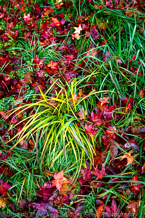
I was originally attracted to the image because of the pattern of the yellow grass and the scattering of the red leaves. The scene was in shade on the afternoon of a late fall day in November – there was not much available light. I can’t remember if I was without my tripod, or just too lazy to use it, but I took the shot handheld. To have a fast enough shutter speed to not have camera shake, I upped the ISO to 1600, which resulted in a shutter speed of 1/60th of a second. It wasn’t enough. Viewing at 100% in Lightroom showed the image was not sharp.
I thought it might be saved with the shake-reduction filter in Photoshop, so I opened up PS. Indeed, the shake-reduction filter seemed to work wonders. My workflow is normally not to bring an image into Photoshop until I’m done with it in Lightroom, but rather than go back to Lightroom, I opened up the camera-raw filter and attempted to do my “Lightroom” processing there. (Adobe Camera Raw and Lightroom reportedly have the same capabilities.) I was quickly reminded why I like Lightroom better than Adobe Camera Raw and scrapped the image and started fresh again in Lightroom.
In Lightroom, I started, as I normally do, by doing a default lens correction and adding noise reduction to counteract the high ISO noise. Following my normal workflow, I went to the Basic menu and worked on the tone and presence. I started by reducing the exposure by about 1/2 a stop, warmed up the temperature to rid the image of blue tones from the blue sky reflection and adjusted the tint to add a bit of green. I then adjusted the clarity (to the mid 20s) and vibrance (to the mid 30s) sliders to punch up the colors a bit. That’s a bit more vibrance than I normally use, but it seemed like it needed it. The vibrance wasn’t helping the reds enough, so I also added a small amount of saturation.
I then set the white point with the white slider and adjusted the highlights slider down. I normally set the white point, usually increasing it, as a way to improve contrast. It often results in the highlights being lighter than I want; such was the case here – thus the reduction of the highlights slider. It took several iterations to get it where I liked. I then set the black point with the black slider (and thus finish the contrast improvement without using the contrast slider, which I normally leave set at zero – as I did here).
At this point, there was one leaf in the upper half of the photo that was too bright and distracting. So I used the brush tool to dim it down a bit. With that bright leaf now dimmer, I made one final adjustment to the white and highlights sliders. Made a final adjustment to the temperature slider, and punched up the image a bit more by using the dehazing slider and added just a touch of vignette to help focus the eye into the image. The result is the second image below.
At that point, I exported to Photoshop and re-accomplished the sharpness fix with the shake-reduction filter. After working that shake-reduction magic, I followed my normal Photoshop workflow for nature/landscape shots by working Tony Kuper’s triple play actions on the lights and darks (these actions use luminosity masks to affect the contrast, brightness and detail definition – in this case I was most interested in the detail definition).
From there I worked on targeted adjustment to bring my final vision out for the image. I wanted to yellow grass to really stand out, so I made mask for the yellows and used it on a levels adjustment layer to make them brighter. I only wanted this effect on the yellow grass in the center of the image, so I placed the levels adjustment layer in a group and masked the group, allowing only the center portion to be affected.
Next, I thought the greens were too bright, so I again made a mask from the greens and used it on another levels adjustment layer to darken them up a bit.
In looking at the image, I still wasn’t happy with the reds, so I added a hue/saturation layer and bumped up the saturation just a bit on the reds only.
I finished it off by adding a dodging/burning layer, and painting black to darken, I darkened approximately the upper 1/4 of the image as well as a bit on the sides and bottom. This improved upon the vignette I had placed in Lightroom. The result – the image you see above.
It took much longer to write this than to do the actual work in Lightroom and Photoshop. I think, in total, it took about 20 minutes. In looking at it now, I think I may have overdone darkening of the shadows. But that is the beauty of Lightroom, I can easily open the PSD file made by Photoshop and lighten up the shadows a little. Maybe I’ll do that if I ever decide to print it, but otherwise, it is ready to print now.
As always, your thoughts and comments are most welcome.


Leave a Reply